Get Your Website Mobile Friendly or Google will Drop Your Search Ranking
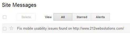
Your website is not mobile friendly message!
At the beginning of March, I was in our Google Webmaster Tools account and found the following message on an older website we maintain.
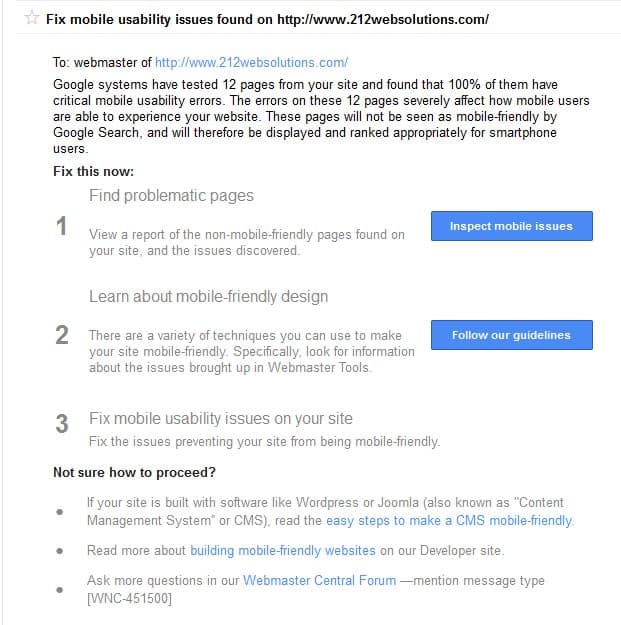
Further examination gave me the details:
We dug in and started researching and found that starting April 21st, 2015; Google will start using mobile as a search ranking factor (SEO). This means websites that are mobile friendly will be higher in search results than websites that aren’t. Google states
“This change will affect mobile searches in all languages worldwide and will have a significant impact in our search results.”
WOW! That’s not a lot of time.
Find out how your website stacks up according to Google using 2 tools
- Google Webmaster Tools tells you what Google thinks of your mobile friendly-ness. If you see messages “Fix mobile usability issues found on http://www.yoursite.com/” like I did, you’ve work to do!
- Mobile Friendly Test tool will get you a quick page check. Enter your URL and Google will examine your page, and provide tips like:
- Text too small to read
- Links too close together
- Mobile viewport not set
The Mobile Friendly Test only checks 1 page at time, but Webmaster Tools checks multiple pages of your website.
Passing the Google Mobile Test
Currently Google gives credit for 3 different mobile friendly technologies; responsive, dynamic, and separate dedicated URL.
- A responsive website has the same URL, but changes layout to fit screen size for phones, tablets, and desktops.
- A dynamic website has the same URL, but use different HTML code for mobile devices and desktops.
- A dedicated URL is when a different website used for mobile devices. Usually mobile.yoursite.com or m.yoursite.com


Does it matter to you?
Find out what your mobile traffic looks like. Check your Google Analytics to get an idea of how many mobile visitors you’re getting on your website.
- Go to the Reporting tab.
- In the left pane, navigate to Audience and,
- Click on Overview.
You’ll see a graph and chart like this. Check out the number and percentage of sessions from mobile.
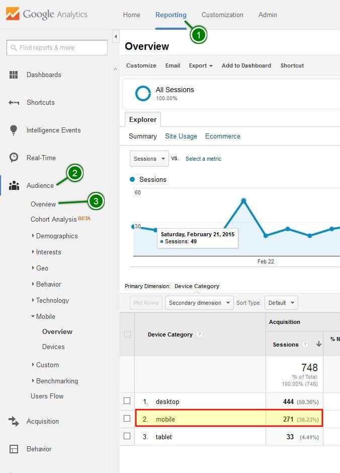
Our picture shows this website gets:
- 271 sessions from mobile devices (mobile & tablet)
- 40% of the visitors use their mobile devices (mobile & tablet)
That’s almost 1/2 of the website visitors. In order keep these visitors on the website, a mobile friendly website is a must.
Don’t get left behind!
As always we’re here to help. We have several solutions that can either fix or get you a mobile friendly site before April 21st. Contact us by clicking the button below, or email us at help@seamrogtech.com.
If you feel inspired to try it yourself, Terence Mace has a more in depth guide on tackling “Mobile SEO: How to Rank in Mobile Search, Following Google’s Mobile Update“.